Analytics Module

The Occuspace Portal provides a rich analytics interface for understanding your space data, allowing you to identify trends and insights from the entire period of time during which measurement occurred. The "Analytics" module is available in the global navigation at the top of the Portal. This page covers the primary functionality of this module and applies to all of the different data dimensions that Occuspace offers.

Overview & Data Dimensions

Upon entering the Analytics module you are placed at the topmost level of your Space Tree and presented with a summary of the data dimensions that are available for you to view at that level. Initial charts and visualizations of the dimensions are shown as well. At the bottom of the page is a table listing any children or subspaces of the current space if they exist. Clicking on a different location in either this table or in the Space Tree will refresh the page with the data available for that space.

The default overview of the Analytics module in the Occuspace Portal

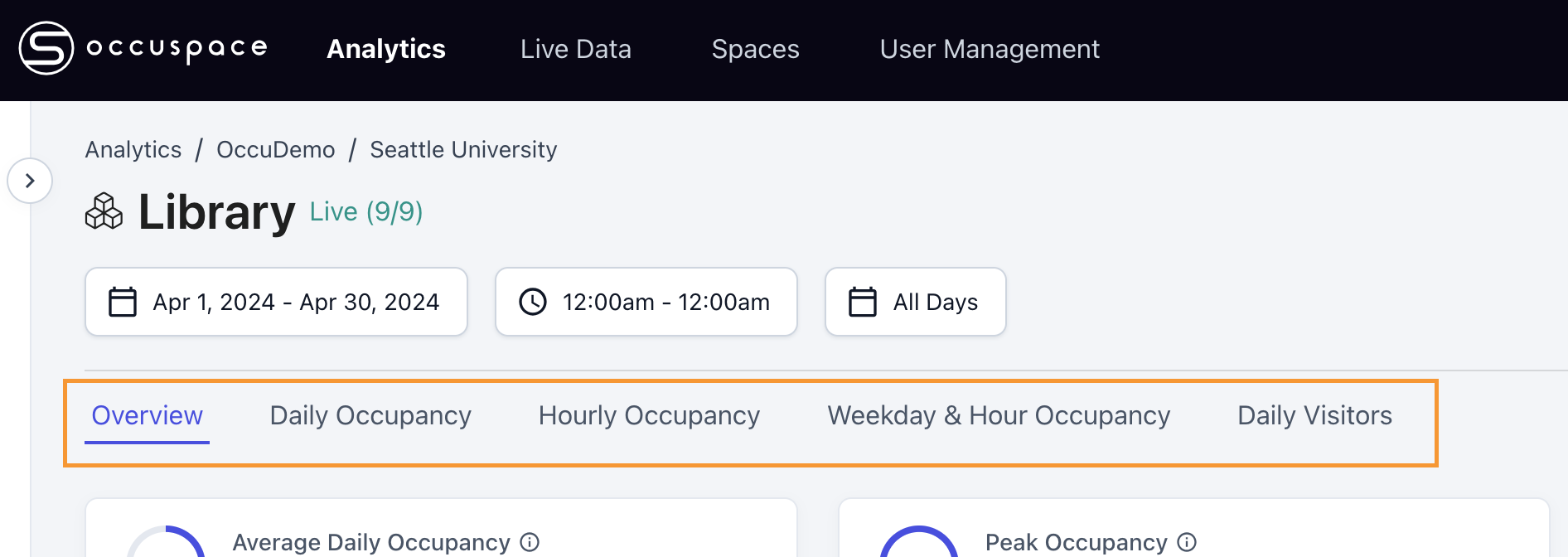
You can dive deeper into any of the data dimensions available by using the secondary navigation element towards the top of the screen (or by clicking on one of the initial chart and data visualizations on summary view).

Analytics provides a secondary navigation bar to move across the various available data dimensions

These deeper views present each data dimension in both visual and tabular formats to satisfy different information analysis needs of users, and allow for a much more sophisticated analysis of each data set. Advanced charting controls, comparison functionality, and exporting capabilities (all covered below) are provided.

Analytics provides deeper views into each data dimension; in the example above the Hourly Occupancy dimension is shown
Date & Time Selection

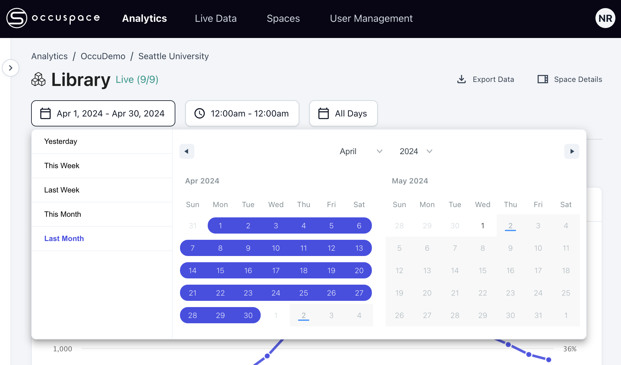
A key configuration option of the Analytics module is the time frame desired for the data analysis being viewed. Analytics always depicts data points in the charts and table elements that are calculated based on the defined date, time, and day range options. These settings are always prominently depicted at the top of the page immediately under the space name header.

You can fine tune the specific dates, times, and days of the week you want to include in your analysis

Users can set the following configuration options when defining the parameters of their analysis:

  • Date Range - You can set the start and end date for your desired analysis. The date range pickers will allow you to select any day in the past going back to the very first day of measurement data for the associated space. Some quick options (e.g. Yesterday, This Week, Last Week, This Month, and Last Month) are provided as suggestions.

  • Time Range - You can chose the start time and end time for your desired analysis, excluding hours that you do not wish to be factored into the results.

  • Days of Week - You can include or exclude specific days of the week in your desired analysis. This is useful for understanding behavior on specific days (e.g. weekdays vs weekend), excluding days you do not wish to have in the results.

Once you make changes to the date and time configuration click on the "Apply" button to refresh the data views and tables on the page. This configuration is retained as you navigate to other dimensions and locations in your Space Tree.

Compare To

The data dimension views provide powerful functionality to compare the current space with other spaces of yours during the same time period, or compare the current space and date/time range with a previous date/time range for the same space.

Comparison functionality allows you to analyze multiple spaces (or time periods) in a single view

You can access this capability from the "Compare to" link at the bottom of the dimension data charts. This link will open a layer allowing you to chose up to five comparison items which are then loaded into the chart and table.

Comparison functionality lets you compare your current space and time range to up to five other spaces or previous periods of time
If you set up a comparison of the current space and move to another data dimension (e.g. from Daily Occupancy to Hourly Occupancy) you can easily establish that same comparison in the new dimension when you click on "Compare to". The layer that appears will have a link at the bottom to use the same comparison set as before.

Data comparisons that have been set up can be easily exported, see below.

Chart Controls

The Occuspace Portal offers a flexible charting system to allow you to visualize your data in many ways. The charts have a number of controls that are important to be familiar with to aid in your analysis.

Average / Peak Display Control

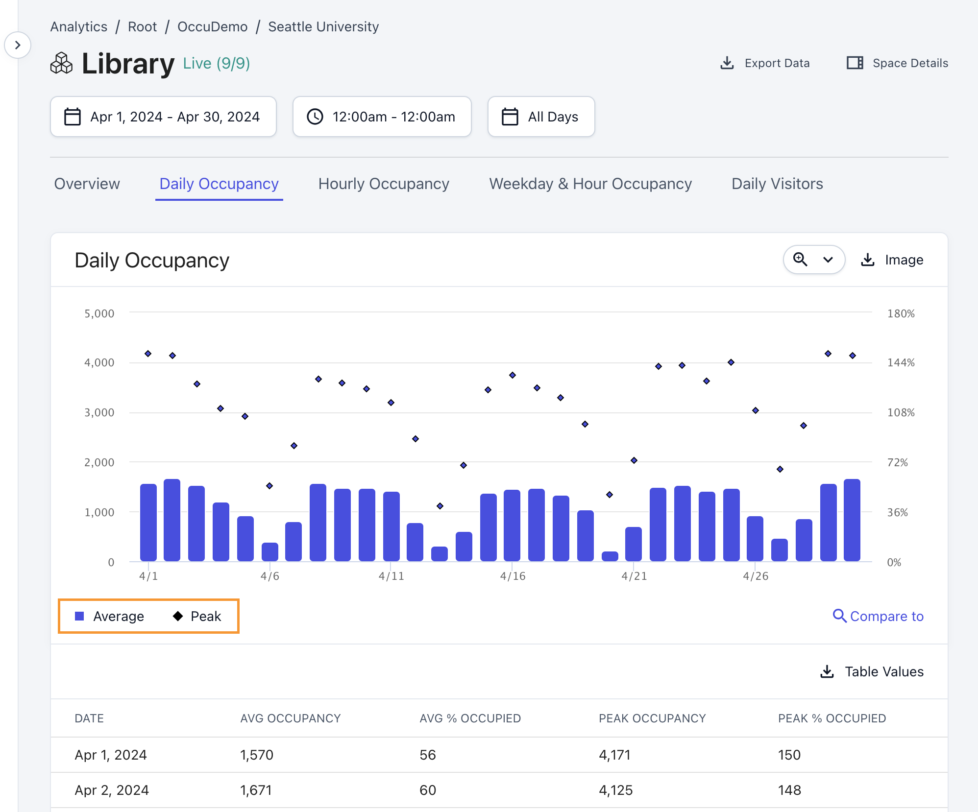
Charts for certain data dimensions (e.g. Daily Occupancy & Hourly Occupancy) allow the user to visualize both the average value and the peak (max) value of a data series over a certain range of time. Enabling and disabling each data series is accomplished via the chart key. You can click on each data series in the key itself to enable or disable it from the chart.

The chart key allows you to toggle on and off the different data series being presented

Zoom Feature

For data series that are represented as a percentage (e.g. "% Occupied" for Daily Occupancy) the chart allows you to zoom in close to the data series maximums, or zoom out to see the data represented at a scale of 100%. This toggle affects the y-axis scaling functionality of the chart, and depending on the particulars of the data you are viewing this can have a large effect on the visualization.

The zoom feature changes the scale of the y-axis to allow you to better understand the chart visualization

Y-axis Toggle (Compare To Mode)

When using the comparison functionality, and viewing a data series that is represented with more than one attribute (e.g. "Average Occupancy" and "% Occupied" for Daily Occupancy) the chart has to show each attribute separately. This toggle switches between the different attributes of the data series in order to create the chart.

Comparison funtionality allows you to view a space against other spaces, or against other time periods

Parallel vs Stacked Bar Display (Compare To Mode)

For comparison functionality the option to visualize the data series as stacked bars instead of parallel bars is available.

Comparison charting can be toggled between parallel and stacked bar visualizations

Exporting Data & Chart Images

The Analytics module provides an extensive number of ways to obtain your data and make use of it in your own workflows.

Export (Raw) Data

The most granular level of your available data dimensions is available via the "Export Data" link at the top right of every page in the Analytics module. For the current configuration of Space Tree selection and date & time range settings you can obtain the base level data enabling all of the visualizations seen in the charts and tables (and in certain cases even more granular data than what is shown in the UI). This data is provided to you in CSV file format that is immediately downloaded to your computer.

Clicking on the "Export Data" link brings up a window allow you to tailor your CSV download more finely. If the current space has more than one data dimension available you will first need to choose the desired dimension for the export. The window allows you to update the date and time range more carefully, and for Occupancy data you can select different data bin sizes for the export. Finally the Space Tree is presented with the current space confirmed for the download as checked. You can select other spaces to include in the download as well. When you are happy with the configuration click on the Export Data button at the bottom right of the window. The CSV file is immediately generated and then downloaded to your computer.

You can export any spaces Occupancy and Visitors data to a CSV file for analysis in your own tools
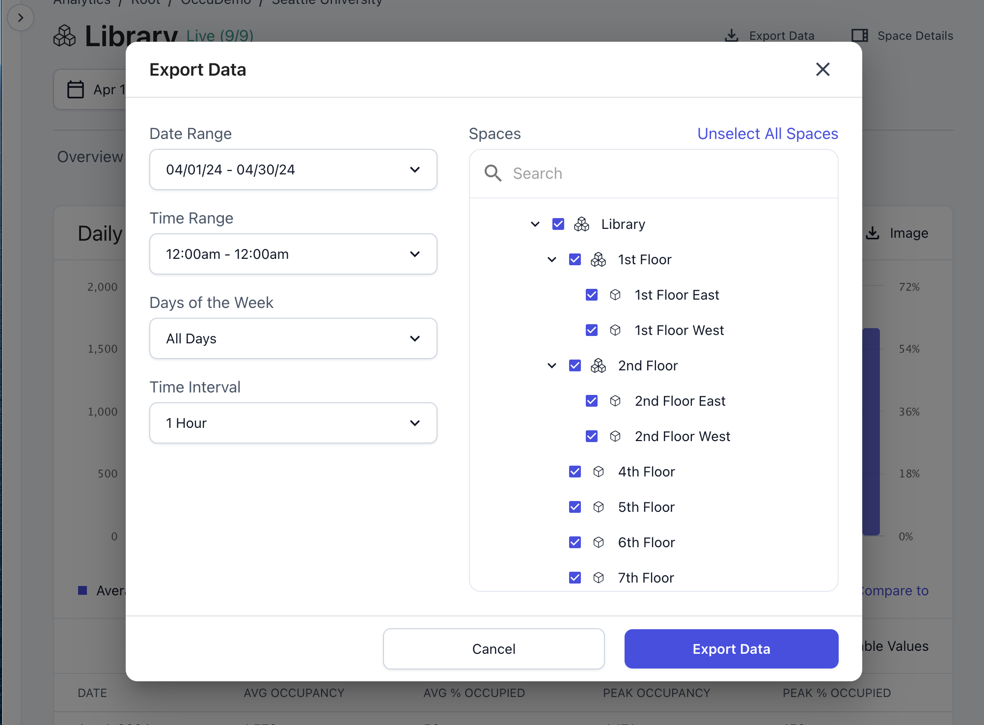
Select the spaces, date and time ranges, and desired data time interval and the file will be downloaded to your computer
Export Table Values

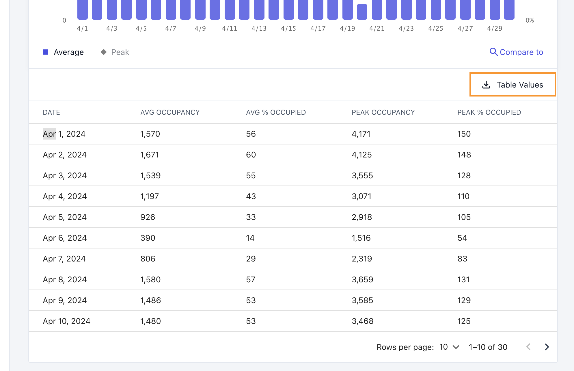
For the different data dimensions shown in the Analytics module you can export the data shown in the tables as CSV files downloaded to your computer. Any data comparisons set up in the charts and tables are included in the CSV files as well. To download this data click on the "Table Values" download link at the top right of any data table.

The table values export functionality downloads a CSV of exactly the data presented in the chart and table, including any comparisons

Chart Image Export

All of the charts in the data dimension views are exportable as PNG images for use in your own materials. Any data comparisons set up in the charts are included in the PNG images as well. To export an image click on the "Image" download link at the top right of any chart on the dimension views.

Export any chart visualization as a PNG image for use in your own presentations and materials

Last updated